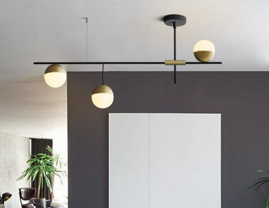
Asymmetry: Lighting Up New Possibilities
Sep 25th 2020
The question of symmetry in lighting design came up recently in one of our articles. When it comes to lighting, symmetry is not necessary. In fact, there is a case to be made for purposeful asymmetry in lighting to create the interesting style and unique focal points.
There’s something quaint and familiar about the image of a bedroom, the bed flanked by end tables each with matching table lamps, a single fixture hanging in the middle of the room or directly above the bed, curtains blowing lazily in the breeze. Maybe this bedroom exists in a picturesque cottage somewhere. There’s an ocean nearby. Few of us live that kind of fairytale existence.
That may be the best way to light a fairytale cottage, but you’ll likely find it doesn’t work quite as well in the real world. We don’t use our rooms in a symmetrical way and our lighting should conform to how we occupy and make use of our space. Lighting should fully illuminate a room, eliminating as many shadows and dark corners as possible. Task lighting is often best when it’s movable - whether that’s a swing-arm sconce, an adjustable floor lamp, or simply a table lamp that can be repositioned if furniture is moved around from time to time.
In addition to simply setting lights up in an asymmetrical way, there are fixtures (such as the one featured above) that are designed asymmetrically; or like the one below: pendants arranged randomly. This draws the eye to these matte black fixtures, breaking up with white of the rest of the room and making a statement with the simple contrast.
The image below features similar but distinct light fixtures arranged above a kitchen island. By mixing these fixtures that are in the same family of design but differently shaped, an element of intrigue is introduced that makes the kitchen much more interesting than if it were lit with identical pendants.
In the photo below you can see recessed lights installed randomly, almost like constellations. This subtle design drives home the point that this is a quirky, unique boutique. We have written before about retail lighting’s effect on customers, and this is another example of how lighting can prep you for what to expect from the garments, quality, and the number on the price tag.
Asymmetry in your interior design can lend an extra air of elegance and interest to your space. Your lighting should be as unique as you are: and at least somewhat moveable, to move with you and support you as you move throughout your space, using it the way you want, not the way the way it’s lit requires you to.
No matter your style, SunLake has the LED bulbs you need to realize your interior design ideas. Click here for SunLake Lighting’s full LED product catalog.


